블로그

Pomon P.
popomonclub@gmail.com
인스트럭션 모달에는 크게 두종류가 있습니다. 게임처럼 한번에 여러개를 보여주는 멀티 팝업과, 한단계씩 이전/다음 버튼을 눌러서 진행하는 싱글 팝업입니다. 이번 포스팅에서는 종류에 무관하게 인스트럭션 모달이 어떤 절차로 렌더링을 해야 하는지 알아보겠습니다.
- 가이드를 각각의 그룹으로 관리할 수 있다.
- 가이드를 순서대로 이동하며 진행할 수 있다.
- 반응형 UI에도 가이드가 제대로 보인다.
StoryXpress | Video creation and hosting for business
StoryXpress is a cloud-based video platform for businesses. Video creation, personalization, hosting and analytics at scale to boost marketing and sales.
storyxpress.co
가이드 팝업 컴포넌트를 사용할 때 알아야 하는 개념이 있습니다!
mix-blend-mod
원하는 부분을 하얗게 구멍뚫린 것처럼 보이게 해주는 속성
StartLayer
가이드 메시지가 시작되는 팝업을 보여주는 레이어
BlendLayer
가이드 메시지가 시작되는 팝업을 보여주는 레이어
CommentLayer
BlendLayer의 컴포넌트 영역과 1:1로 매칭되는 메시지 영역을 보여주는 레이어
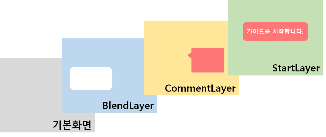
부모 요소와 어떻게 혼합되어야 할지 정하는 스타일입니다. 다양한 옵션을 제공하고 있으며, 여기에서는 mix-blend-mode: hard-light; 옵션을 사용했습니다. 이 옵션을 사용하면서 부모 요소의 배경색을 background-color: rgba(0, 0, 0, 0.5)로 설정하고 자식 요소의 배경색을 background-color: rgba(255, 255, 255,) 로 설정하면 자식 요소의 부분이 흰색으로 뚫린 것처럼 나오는 것을 확인하실 수 있습니다.
.parent{
  mix-blend-mode: hard-light;
  background-color: rgb(0, 0, 0, 0.5);
}

.child{
  background-color: rgb(255, 255, 255);
}
See the Pen Horong - mix-blend-mode by HongJiseong (@as-you-say) on CodePen.
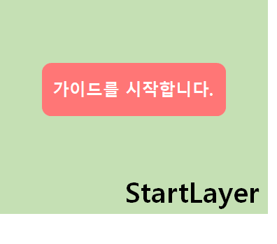
일반적인 모달 팝업의 스타일을 따르면서, position: fixed 속성과 height: 100vh 속성이 함께 작용하면서 화면에 가득 차서 움직이지 않는 모달 팝업이 보여집니다. 튜토리얼 가이드 메시지가 시작되는 팝업이며, 이 팝업의 역할을 두가지 입니다.
1. 팝업을 시작한다는 메시지를 띄워준다.
2. 사용자가 가이드를 위해서 다음 버튼을 누를 때까지 렌더링 시간을 벌어준다.
2번에 언급한 내용은, 가이드 메시지를 위해서는 각각의 영역의 좌표를 얻어야 합니다. 하지만, 모든 컴포넌트가 전부 렌더링이 완료된 시점을 알기는 조금 힘듭니다. 가장 마지막에 렌더링 되는 컴포넌트가 무엇인지 알 수 있는 방법을 아직 찾지 못했습니다.
그래서, 시작한다는 메시지를 띄우는 팝업으로 최대한의 시간을 벌기 위해 이 StartLayer를 사용하기로 했습니다. 초기 회원가입 시에는 2개의 비디오만 보이기 때문에 렌더링 시간이 1초 정도면 충분했습니다. 이 StartLayer를 사용하면서 2초 이상의 시간이 확보 되었습니다.
const modal = css`
  cursor: default;
  position: absolute;
  top: 0;
  left: 0;
  pointer-events: auto;
  inset: 0px;
  width: 100%;
  z-index: 10000;
  color: #fff;
`;

const StartLayer = styled.div`
  ${modal}
  background-color: rgba(0, 0, 0, 0.3);
  z-index: 20000;

	/* 고정팝업 */
  height: 100vh;
  position: fixed;
`;
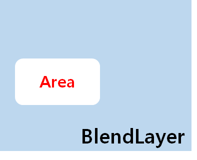
위에서 설명한 것처럼 부모 요소의 배경을 어둡게 하고, 자식 요소를 하얗게 만들어주는 레이어입니다. BlendLayer 안에는 가이드를 위해 구멍을 뚫기 위한 Area 라는 요소가 들어갑니다. 이 Area 라는 요소는 mix-blend-mode 속성을 가지고 있는 BlendLayer 요소 안에서 하얗게 뚫린 영역을 나타냅니다.
const modal = css`
  cursor: default;
  position: absolute;
  top: 0;
  left: 0;
  pointer-events: auto;
  inset: 0px;
  width: 100%;
  z-index: 10000;
  color: #fff;
`;

const BlendLayer = styled.div<{ height: number }>`
  ${modal}

  /* 블랜드 요소를 위한 스타일 */
  background-color: rgba(0, 0, 0, 0.3);
  mix-blend-mode: hard-light;

  /* 화면 사이즈에 따른 높이 설정 */
  ${({ height }) => {
    if (height) {
      return css`
        height: ${height}px;
      `;
    }
  }}
`;
Area는 화면과 가이드를 보여줄 컴포넌트의 영역에 따라서 좌표가 달라진다는 부분, 회색의 배경을 제외하면 특별한 속성은 없습니다.
const area = css`
  border-radius: 4px;
  opacity: 1;
  pointer-events: auto;
  transition: opacity 0.2s ease 0s;
  display: flex;

  /* 절대좌표 */
  position: absolute;
`;

const Area = styled.div<{ rect: Item; show: boolean }>`
  ${area}

  /* 회색 */
  background-color: rgb(128, 128, 128);

  /* 절대좌표 할당 - 화면, 컴포넌트 영역에 맞는 위치에 따라 달라지는 좌표 */
  ${({ rect }) => {
    return css`
      width: ${rect.width}px;
      height: ${rect.height}px;
      left: ${rect.left}px;
      top: ${rect.top}px;
    `;
  }}

  /* 단계에 따라 해당하는 Area가 보여지도록 도와주는 속성 */
  ${({ show }) => {
    if (!show) {
      return css`
        display: none;
      `;
    }
  }}
`;
@ 중요!
배경이 투명도가 높은 검정색, Area는 회색, 보여지는 실제 컴포넌트는 흰색으로 3가지 조합이 맞아야 구멍뚫림 효과가 적용됩니다.
BlendLayer
- 투명한 검정
- rgba(0, 0, 0, 0.3)
Area : 회색
- 회색
- rgb(128, 128, 128)
실제 보여지는 컴포넌트
- 흰색
- rgb(255, 255, 255)
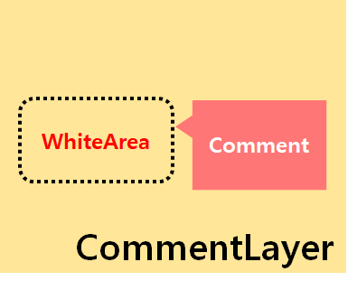
CommentLayer는 BlendLayer에서 정의한 Area 위치 바로 근처에 Comment를 보여주기 위해서 존재합니다. 기존의 Area 위치에 WhiteArea 라는 공간만 할당을 하고, background: none; 으로 설정하여 그 뒤에 있는 BlendLayer의 Area 영역이 보여지게 됩니다.
const WhiteArea = styled.div<{ rect: Item; show: boolean }>`
  /* 빈 공간 */
  background: none;

  ${area}
  ${({ rect }) => {
    return css`
      width: ${rect.width}px;
      height: ${rect.height}px;
      left: ${rect.left}px;
      top: ${rect.top}px;
    `;
  }}
  ${({ show }) => {
    if (!show) {
      return css`
        display: none;
      `;
    }
  }}
`;
WhiteArea의 위치를 기준으로 Comment 좌표가 설정됩니다. 우선 CommentBox로 WhiteArea 안을 가득 채우는 공간을 정의해준 다음, Comment 컴포넌트로 위치를 할당합니다.
중요한 부분은 절대좌표로 position: absolute; 를 사용중이라는 것과, type 속성에 따라서 좌표가 바뀐다는 것입니다.
const CommentBox = styled.div`
  flex: 1 auto;
  position: relative;
`;

const Comment = styled.div<{ type: string }>`
  /* 절대좌표 */
  position: absolute;

  display: flex;
  flex-direction: column;
  padding: 16px;
  background-color: ${background};
  border-radius: 10px;
  box-shadow: 0 0 5px rgba(0, 0, 0, 0.3);
  width: 200px;
  @media ${device.md} {
    width: 330px;
  }

  &:after {
    content: '';
    position: absolute;
    width: 0;
    height: 0;
    clear: both;
  }

  ${({ type }) => {
    /* 오른쪽 팝업 예시 */
    if (type === 'right') {
      return css`
        /* Bottom - 태블릿 부터는 아래로 이동 */
        top: calc(100% + 30px);
        right: 0;
        &:after {
          ${topArrow}
          right: 10%;
          top: -20px;
        }
        /* right - 웹에서는 오른쪽 팝업 */
        @media ${device.md} {
          top: -10px;
          left: calc(100% + 30px);
          &:after {
            ${leftArrow}
            left: -40px;
            top: 10px;
          }
        }
      `;
    }

    /* Comment 타입에 따라 좌표를 위/아래/오른쪽/왼쪽 으로 이동 */
  }}
`;
React App
horongd.github.io
| [Material-UI/Grid] 동일한 간격을 유지하기 위한 그리드 사용법 (0) | 2021.03.05 |
|---|---|
| [Frontend/Deploy] 리액트 깃허브에 배포하기 (1) | 2021.02.12 |
| [Frontend/Flexbox] display: flex를 이용하여 효율적으로 작업하기 (0) | 2021.01.29 |
| [Frontend/Warning] Warning: A component is changing an uncontrolled input of type text to be controlled. (0) | 2021.01.27 |
| [Frontend/RegularExpression] 자바스크립트 정규표현식 (0) | 2021.01.27 |